HUE
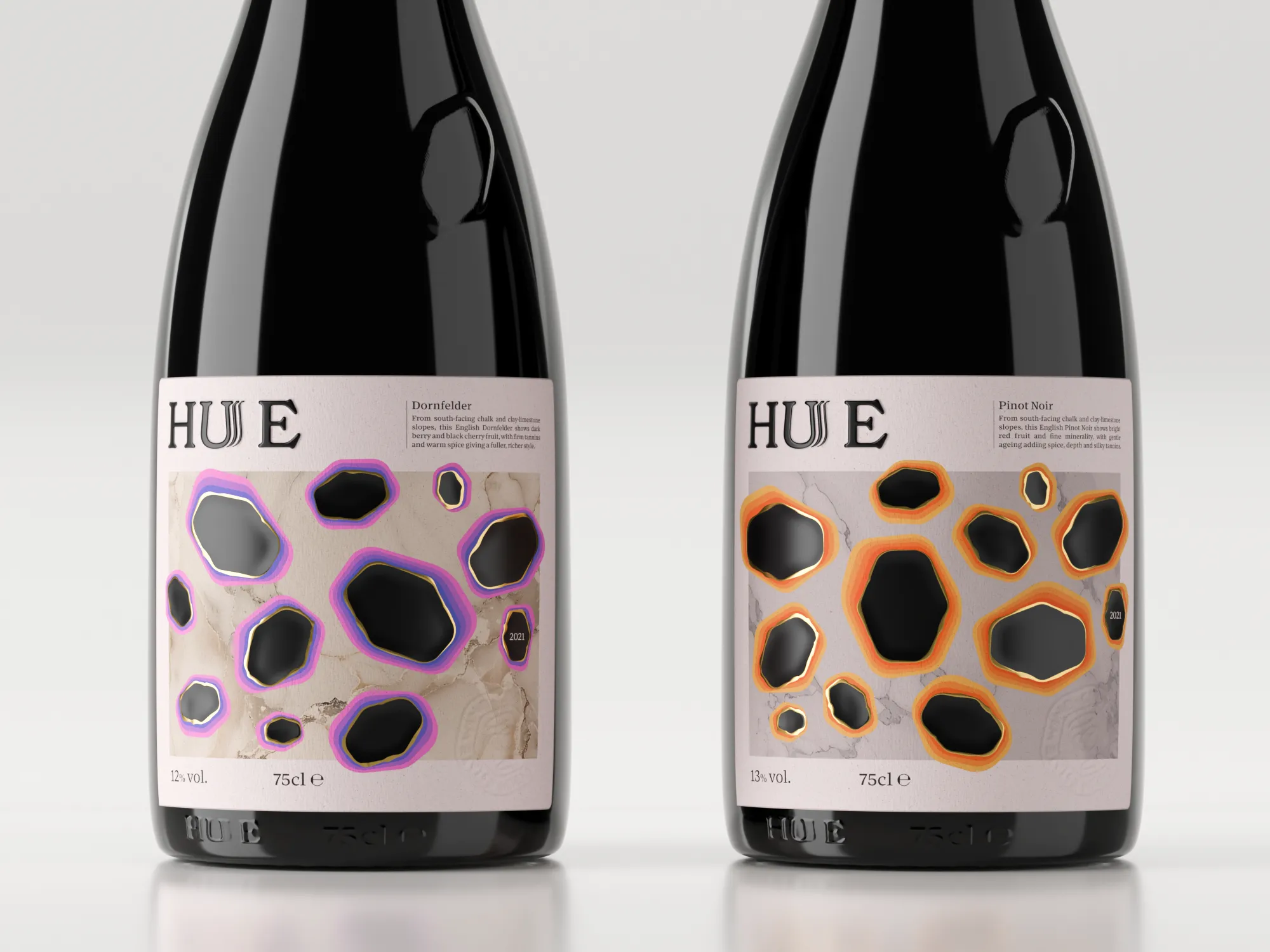
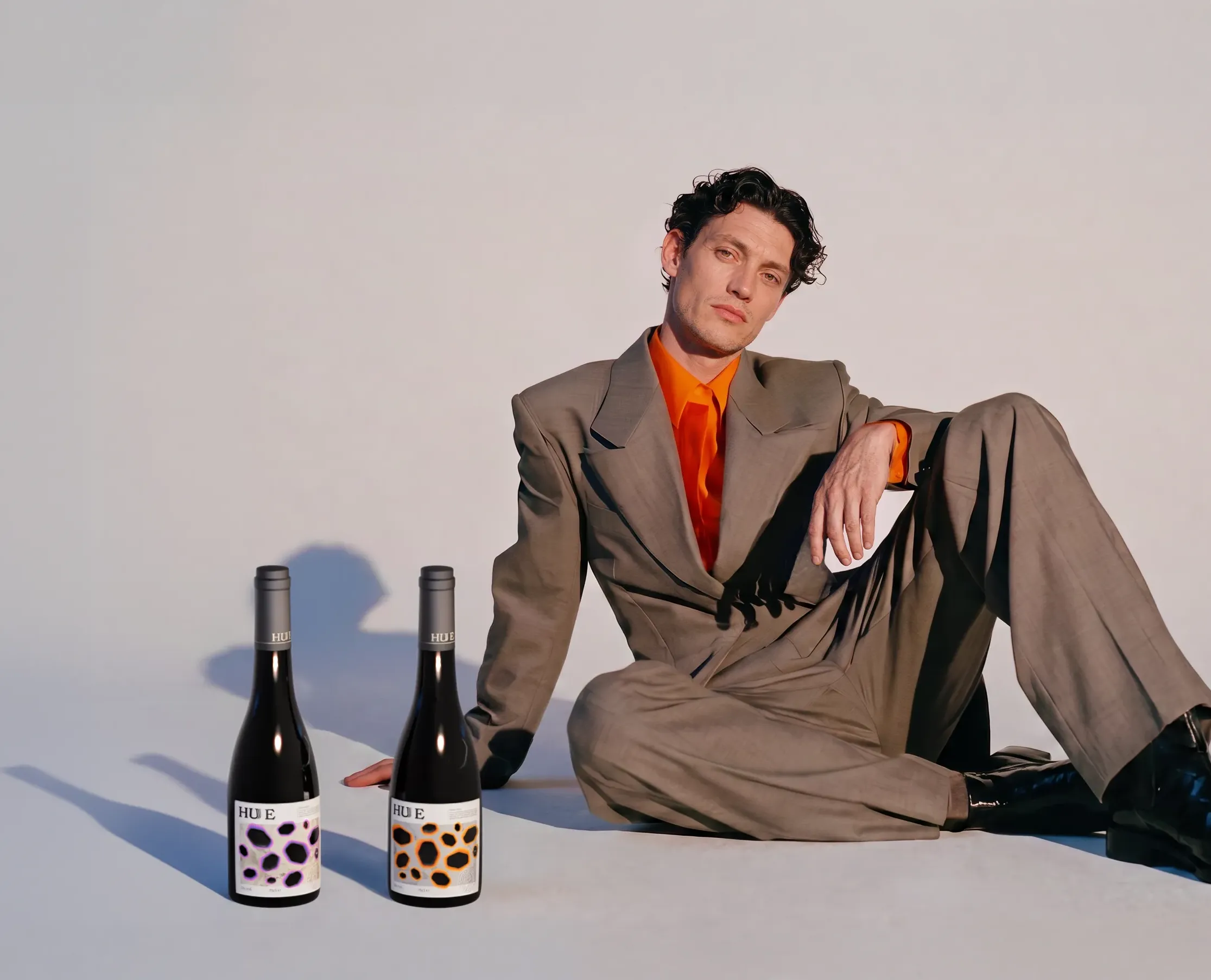
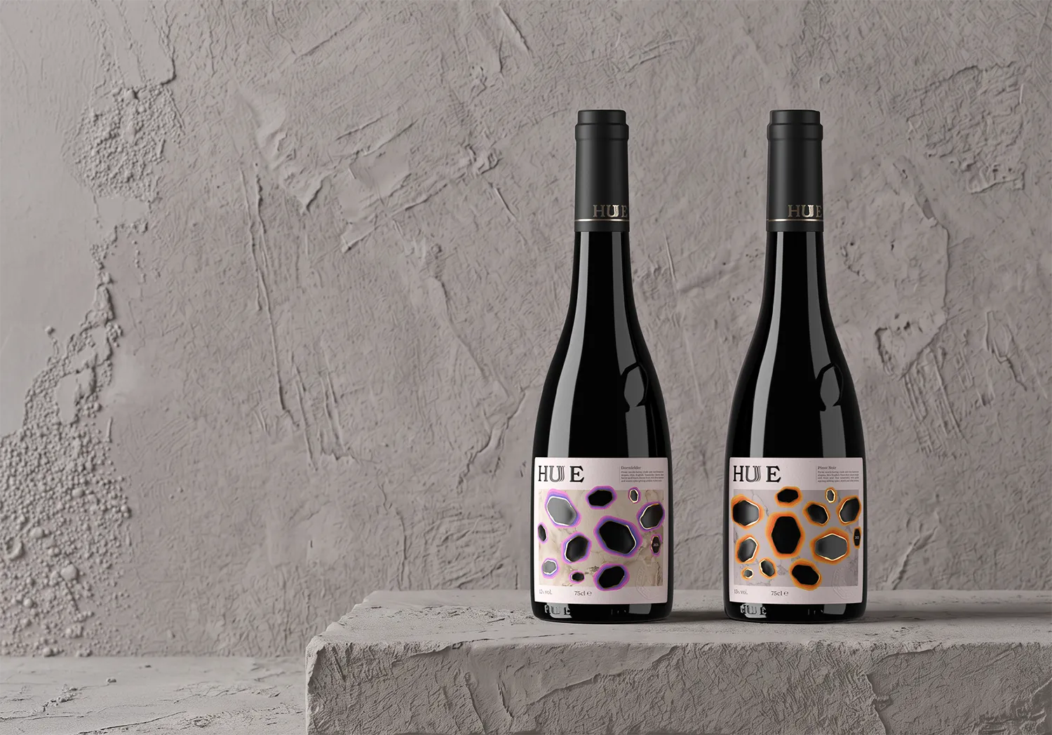
HUE is a packaging design project created to challenge the common perception that English wine lacks depth and character compares to their continental counterparts.
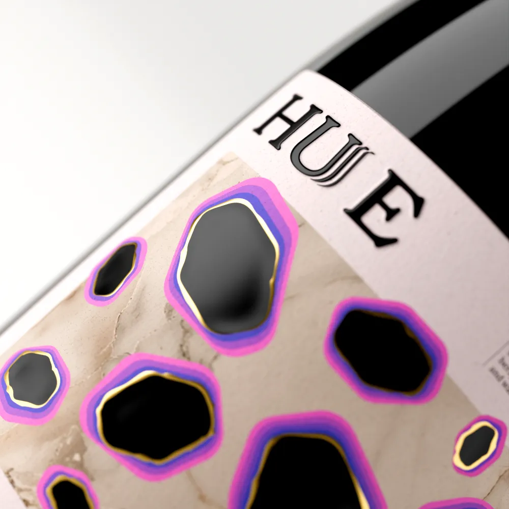
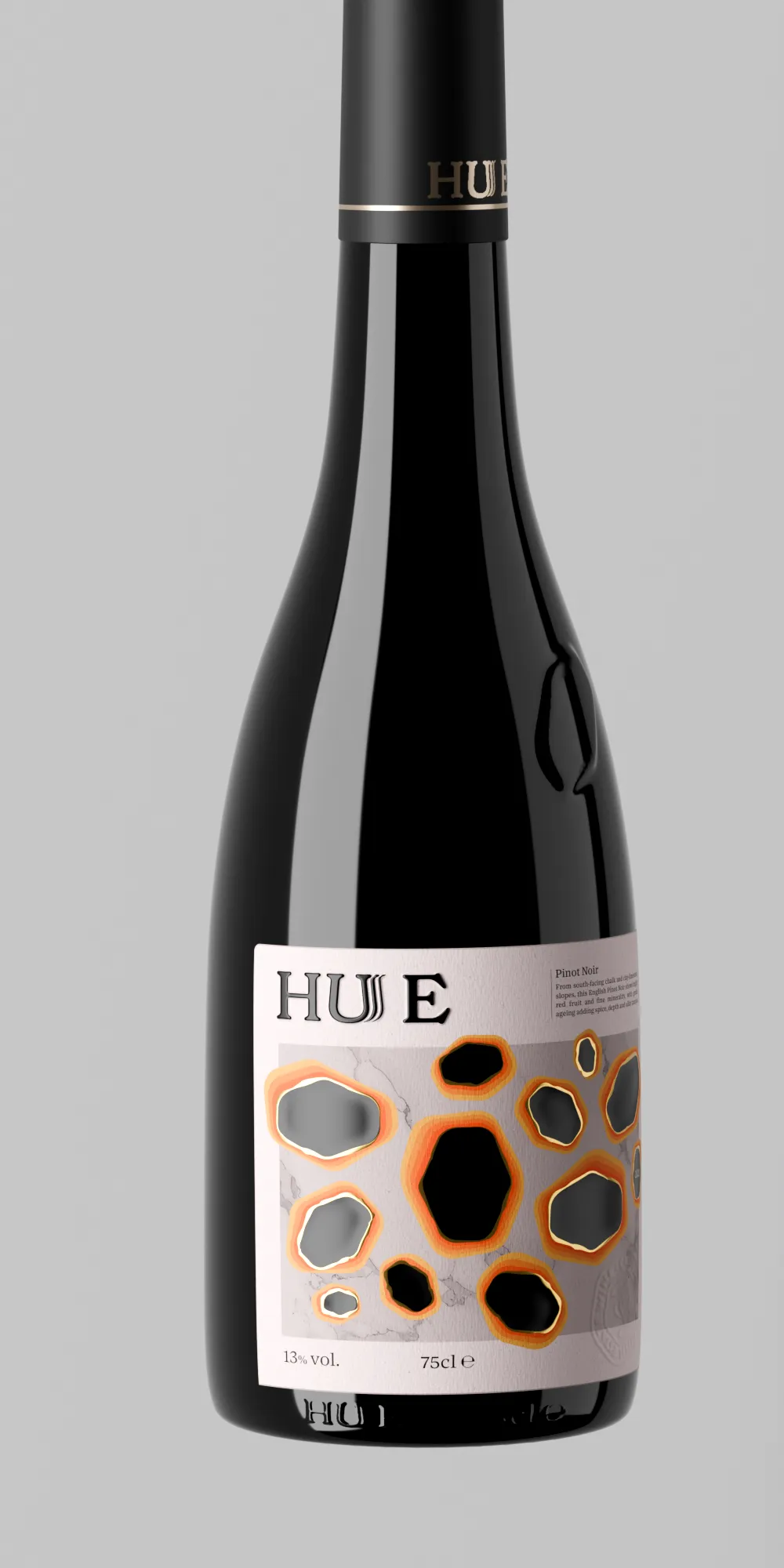
The design is inspired by the shifting depth of colour revealed when wine is tilted in a glass. This quality is translated into a gradient-based label system, with each transition representing the wine’s flavour, body and profile. From light and easy-drinking to rich and complex, the system helps consumers intuitively choose a wine according to their individual tastes.